ASPEN FILM - ANNUAL FESTIVAL BRANDING
SCOPE
Event Look Design
Event Material Design
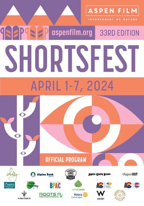
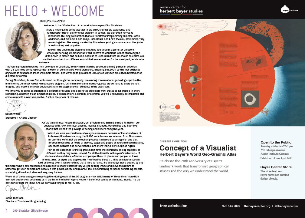
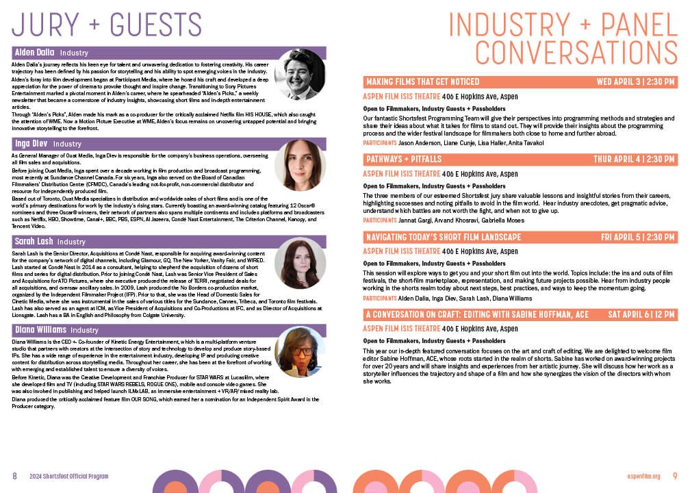
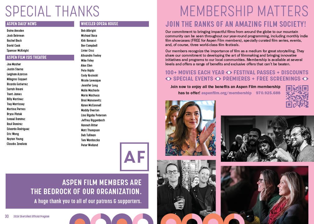
Program Book
Banners
Posters
Postcard
Digital Ads
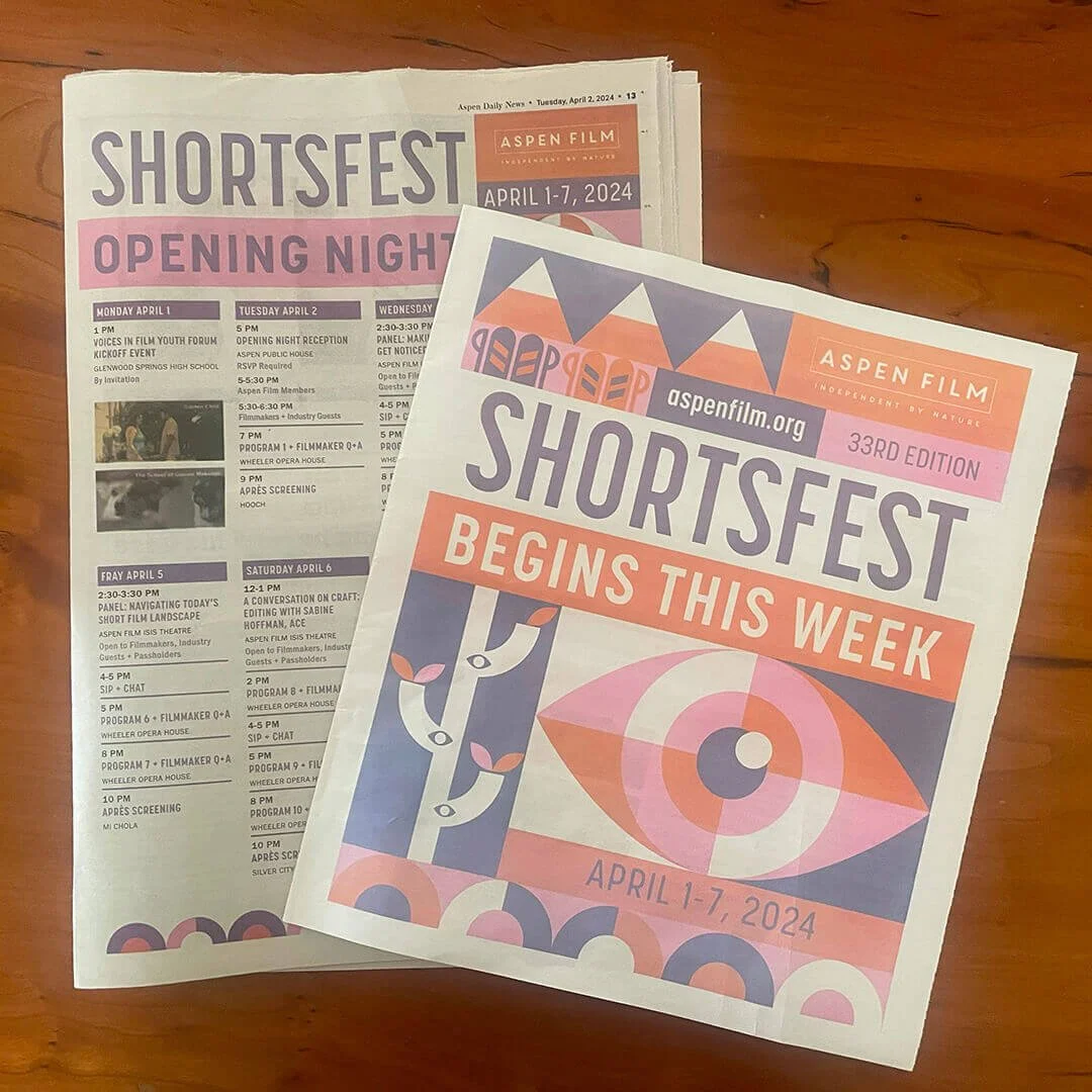
Newspaper Ads
Newspaper Insert + Wrap
Badge
On-screeen Presentation
SUMMARY
In June of 2023, Aspen Film came to me to design the event branding/look for their annual event, which consist of:
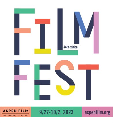
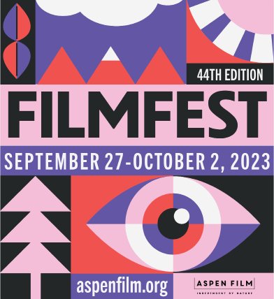
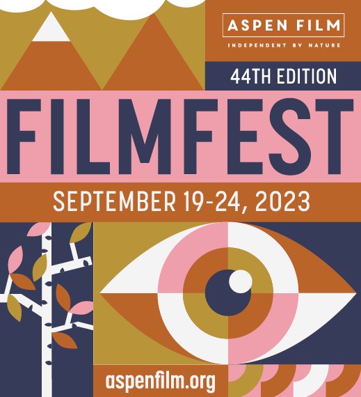
Filmfest in September/October
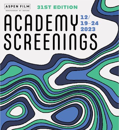
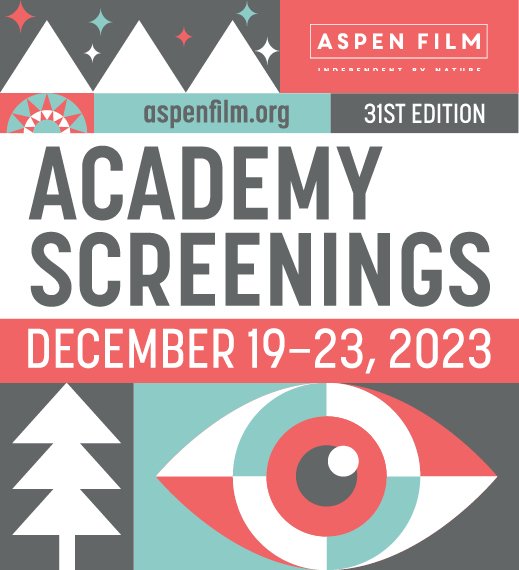
Academy Screenings during the winter holidays
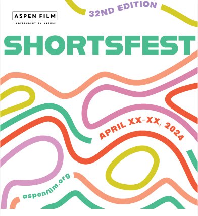
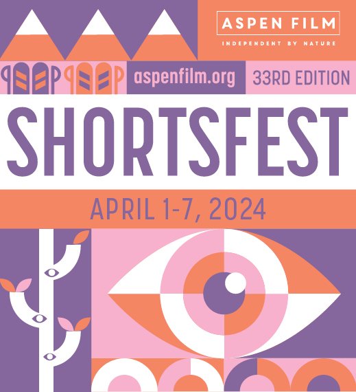
Shortsfest in April
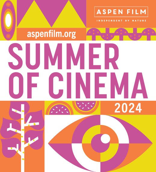
Summer of Film in June, July + August
The challenge, of course, was to design a look that could be adapted to the four different festivals both through color and varying graphics while also maintaining a sense of cohesion amongst the events.
Aspen Film was looking for a fun, colorful, dynamic and modern design that would boost the energy and buzz their events generate each year in Aspen. While they also wanted the annual event branding to reflect the fact that they are based in a ski town, they didn’t want the often-used mountains and aspen trees to be the dominant imagery.
Rough Concept Development
Round 1 - Rough Concepts
After sketching and exploring a number of ideas, I developed and presented four options for the 2023-24 event look. I landed on two options that were based on topographic maps, an often used tool for navigating in the mountains, one quadrant style option that would include abstract icons representing aspects of mountain life AND film, and one strictly typographic option that was playful and modern.
Concept Refinement
Round 2 - Refined Concepts 1 + 4 and Color Palettes
The team initially asked me to further explore both Concept 1 and Concept 4. This included not only applying the look to a number of pieces they would need for each festival but also presenting two color palettes for each festival.
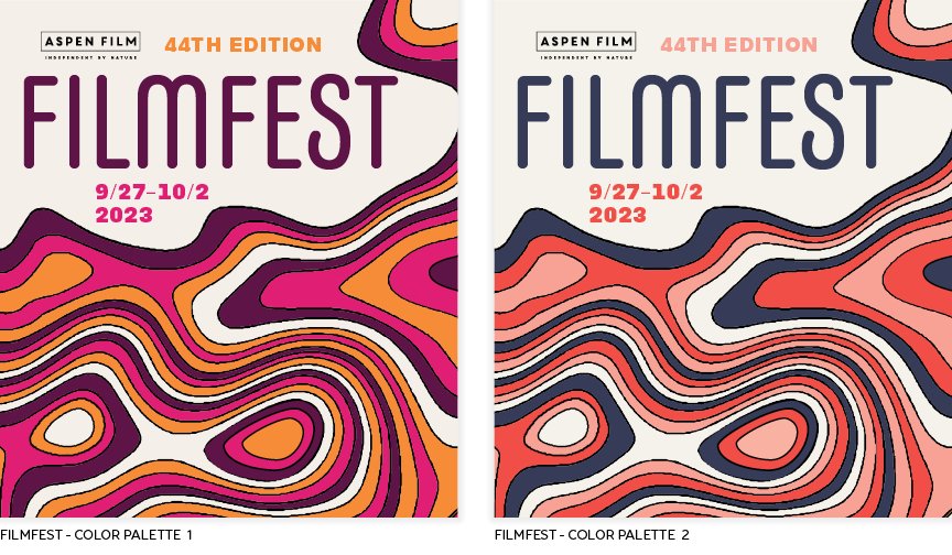
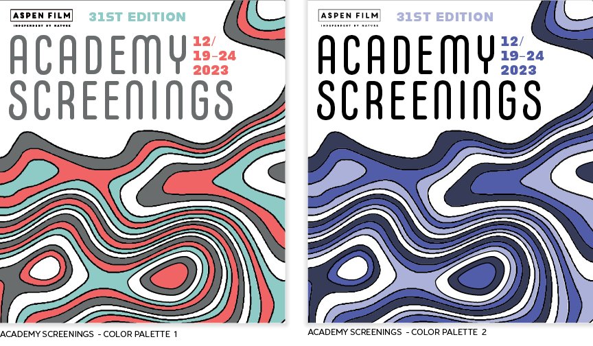
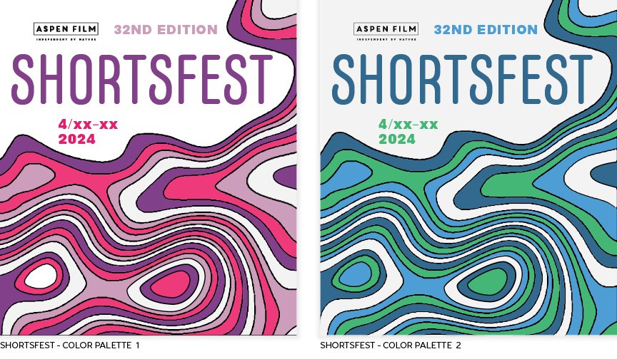
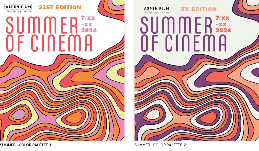
Concept 1 was based on the idea of a topographical map, something that’s often used by hikers and backpackers while in the mountains. An essential piece of gear used to navigate in the backcountry, a topo map flattens the terrain into lines that show where mountains, lakes, trails, and even buildings are. Graphically speaking, they can be terrifically interesting and are highly representative of life in the mountains, so I adapted the style for our needs.
Concept 4 was largely based on my annual calendar, which for the past few years has focused on colorful, simple, abstract illustrations and shapes. It’s as close to a “signature style” as it gets for me, and it seemed ideal for this project as I could easily adapt the graphics for each season and move the various “boxes” around to fit in the pieces each festival. Those pieces range from short and wide (street banners) to tall and narrow (print ads), so any concept would need to be adaptable to both orientations and everything in between, which can often be challenging.
Concept Selection
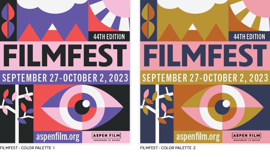
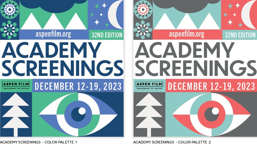
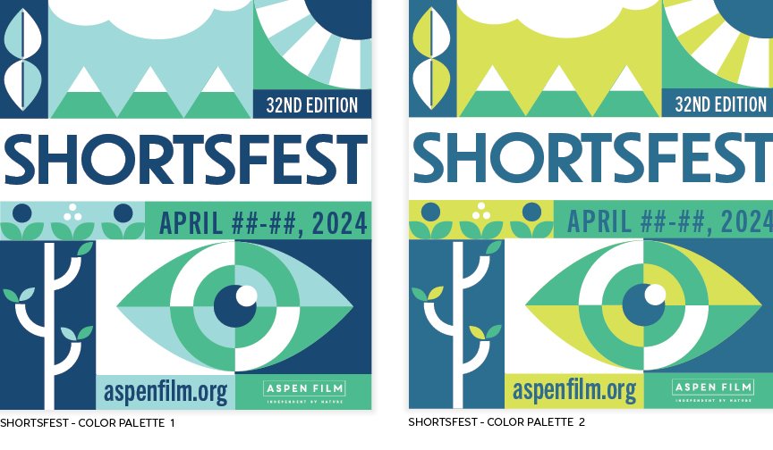
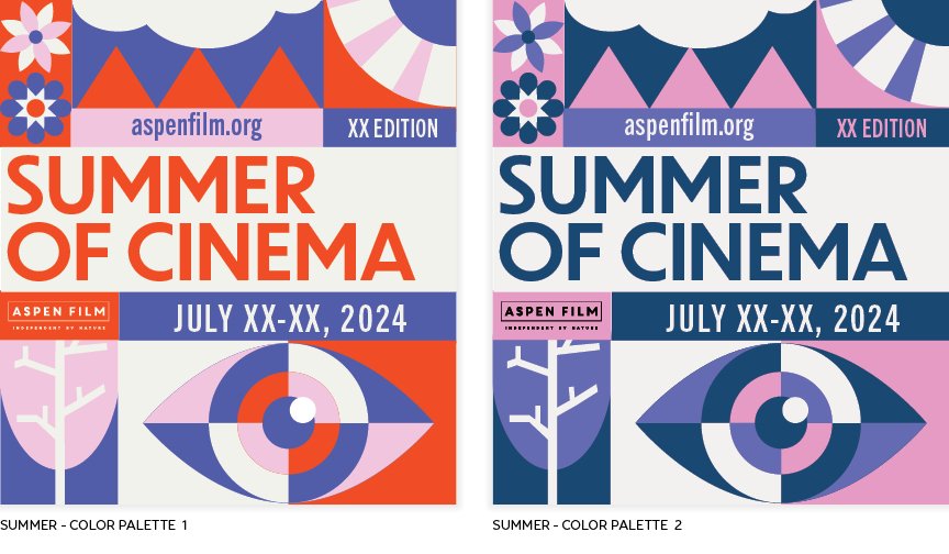
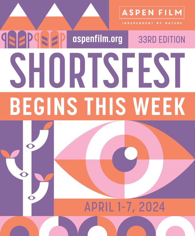
In the end, Aspen Film selected Concept 4 for the final 2023-24 festival branding. While the artwork evolved for each festival even after these final looks and color palettes were selected, the general idea remained the same for the entire year. Each event’s look included the abstract, compartmentalized eye symbol, an abstract tree and mountains that reflected the seasons, shapes that served to fill in spaces when needed, and, for Shortsfest and Summer of Cinema, seasonal recreational equipment that also reflected the seasons.
final selected festival looks
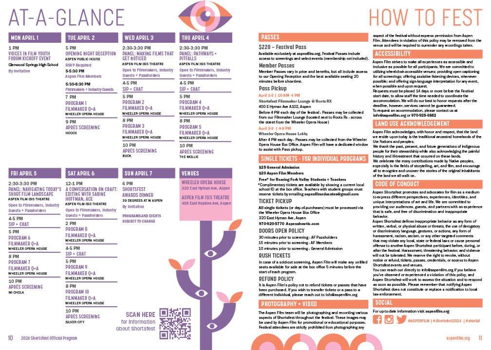
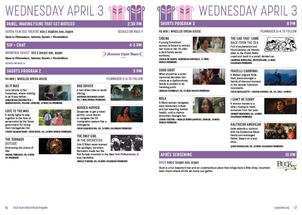
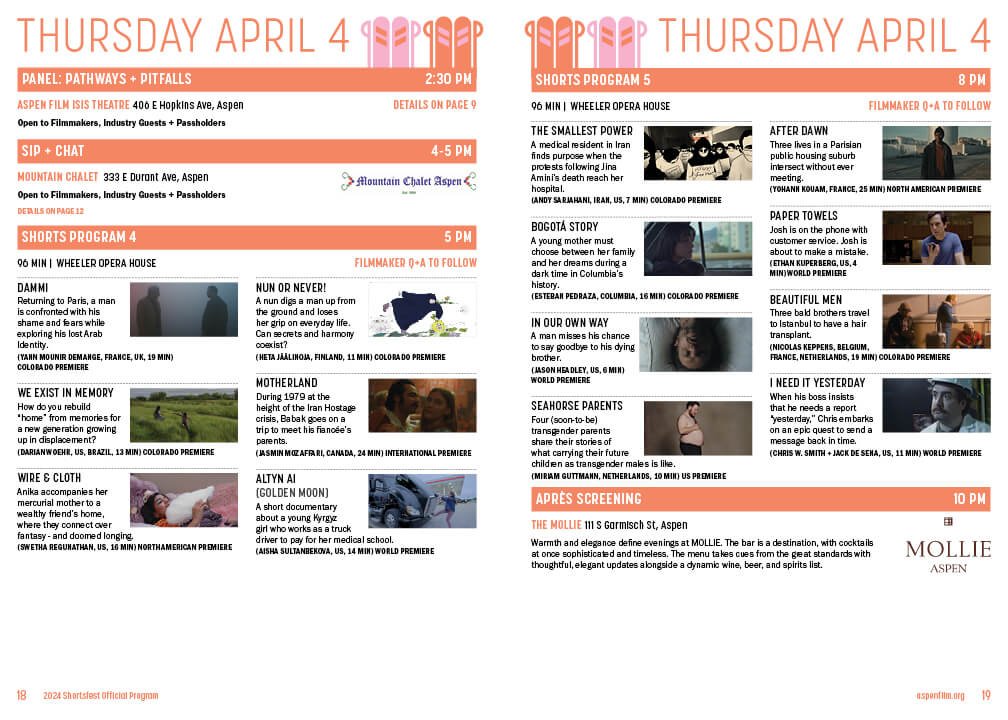
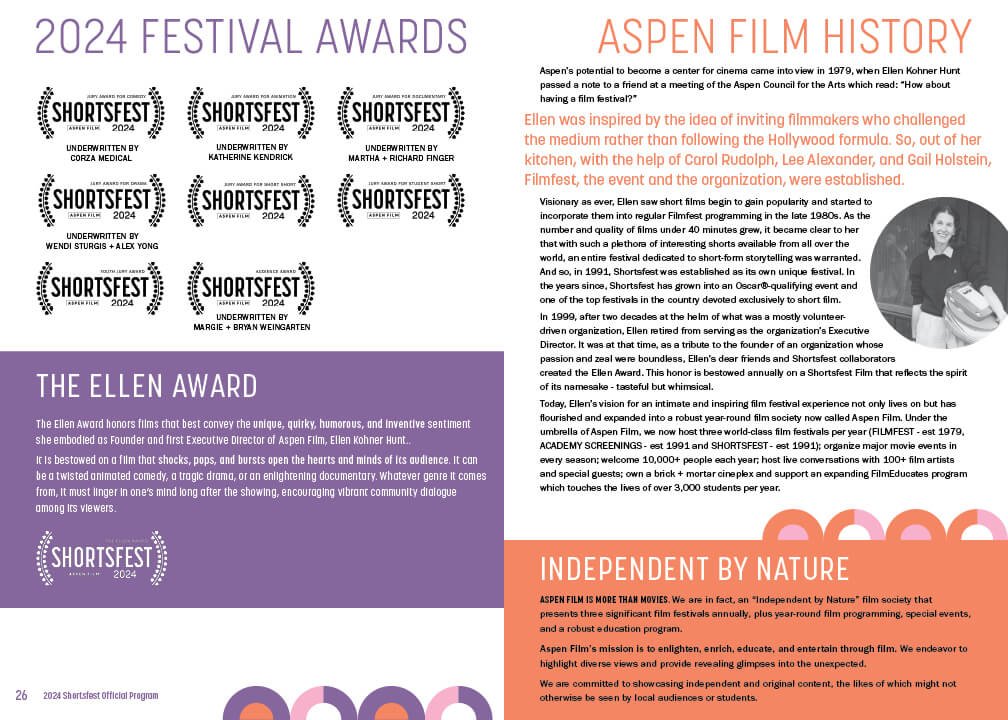
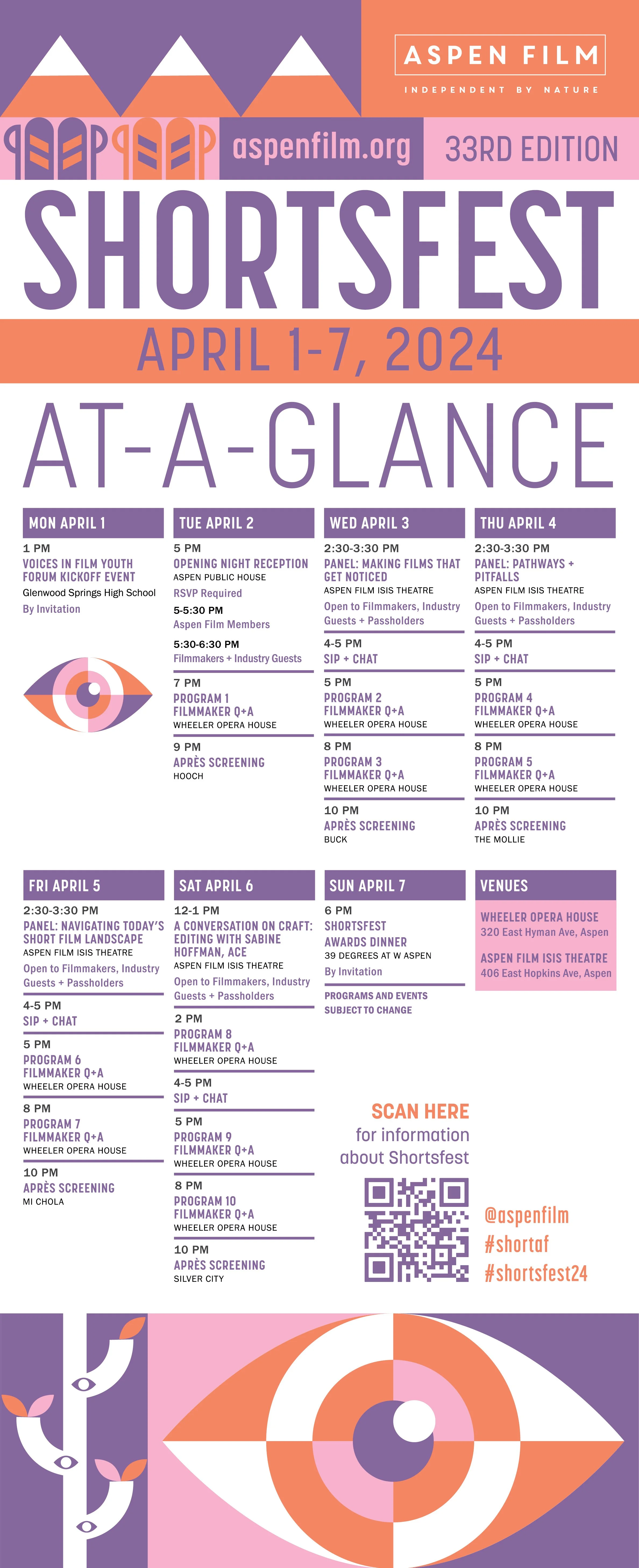
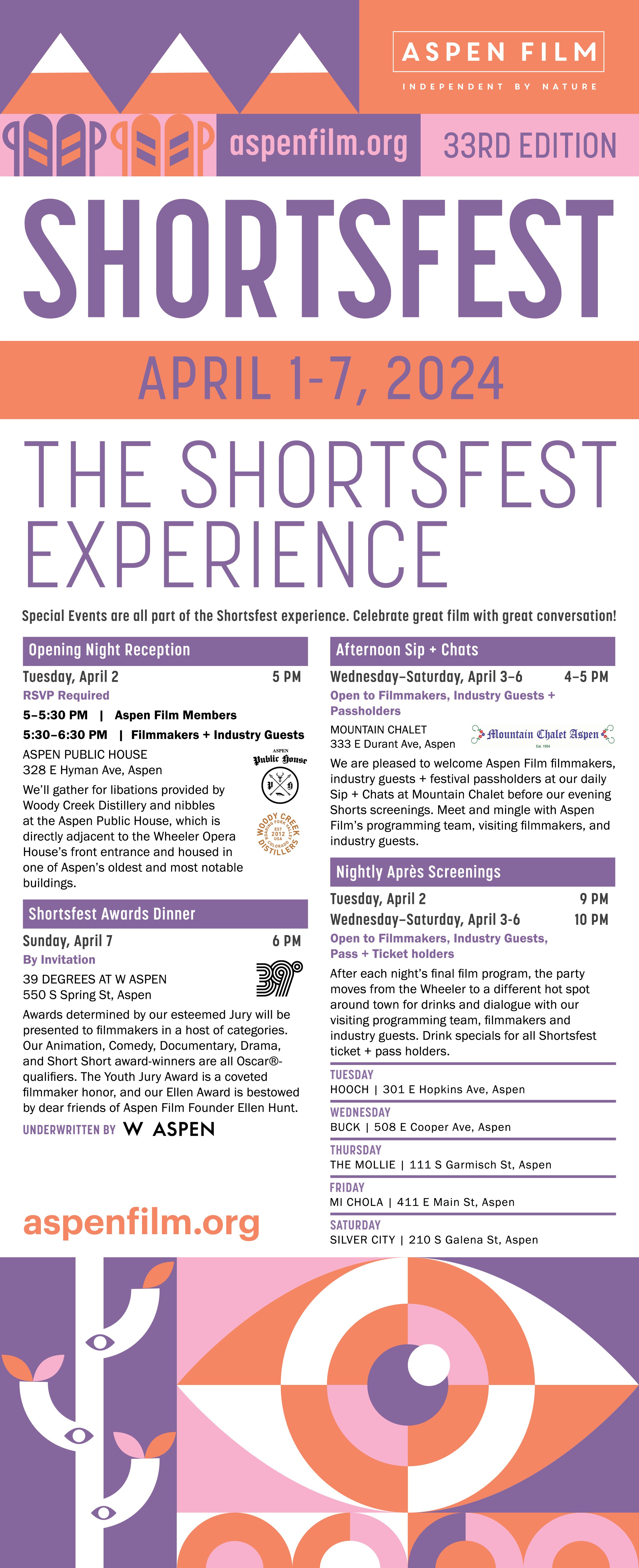
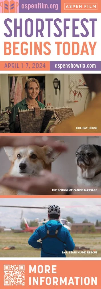
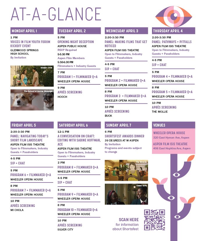
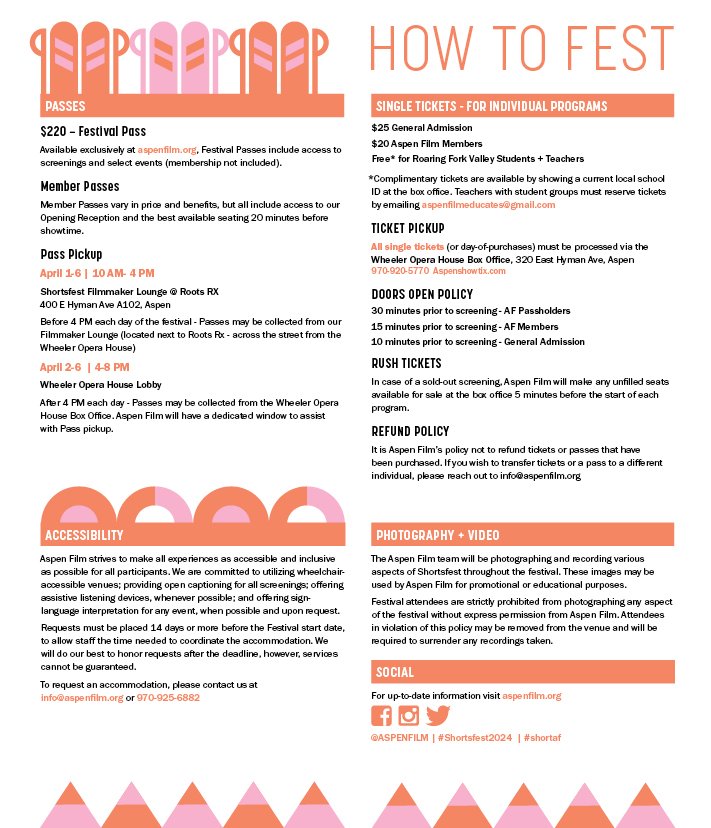
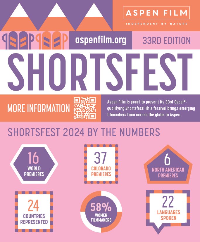
Application - Shortsfest 2024
Typically, each festival requires roughly the same pieces designed, although the quantity ranges depending on the size of the event. As the largest festival of the year, Shortsfest is Aspen Film’s flagship and requires the most design work.
Program Book
Banners
Street Banner
Retractable Banners
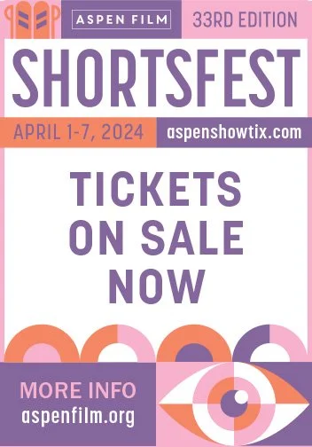
Print Advertising
1/4 Page
1/4 Page
1/2 Page
Full Page
Digital Advertising
1140x90
600x150
320x50
728x90
Newspaper Wrap
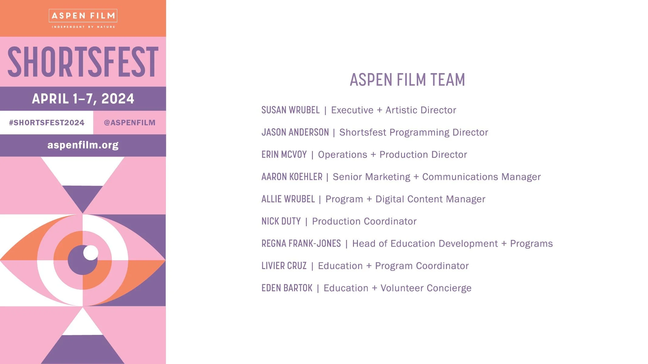
On-screen Elements
GOBO
on-screen presentation slide

